Cross-Country Race Analysis
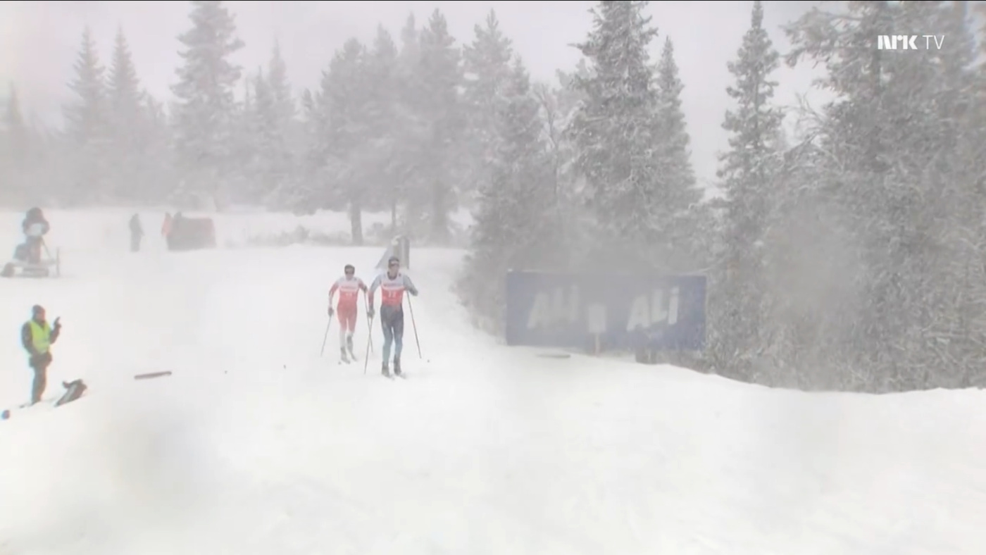
The data we show here is from the 15 km (3x 5 km) classical FIS race in Beitostølen on Nov 21 2020. Our sensor was worn by Livio Bieler. No Archinisis staff was present, the athelte did the recording all by himself and sent us the data after the race.
In the middle of the race, approximately after Livio's first round strong winds and heavy snowfall set in. Tough conditions, but perfect to show how changing conditions can affect performance.
The Race Track
The track map and elevation profile of the track are shown below. The track was skied three times "kind of clockwise". The first 200m and the last 100m have been cut off so that we could use this exact same track for all three laps.
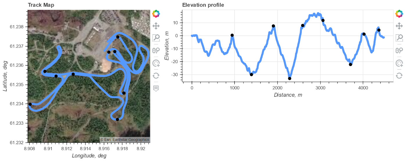
The black dots denote the split times that we added after the race. They can always be changed on our webapp. No extra device or measurement to mark the splits is required.
Continuous split times
The continuous split times provide an overview about where an athlete lost how much time. The first lap was taken as a reference and has always the time 0. Lap 2 and 3 then show the speed gain / loss relative to the first lap. If the time is positive, this means that the laps were slower (i.e. the athlete lost time), compared to the first lap.
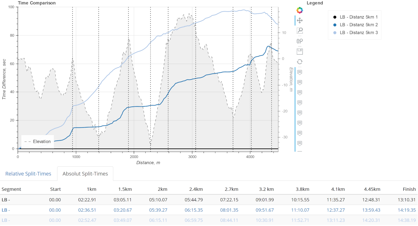
We can easily see that Livio lost a lot of time for both laps 2 and 3. However, not the same way: at the end of lap 3 he was even able to make up some time. Interestingly, for lap 2, the most time was lost during the uphill and not the downhill, despite the high winds and snowfall.
If we had only the regular spit times, for example placed ever 1 km, we would never have been able to see these details and learn where exactly how much time was lost
Sub-technique plots
To gain further insights in the performance our race report also provides sub-technique plots: they show which sub-technique was used where and how the speeds compare. Only with these plots we can fully understand the origin of a speed / performance / time difference: was it different because the athlete chose a different sub-technique or was it different because of fatigue and changing environment?
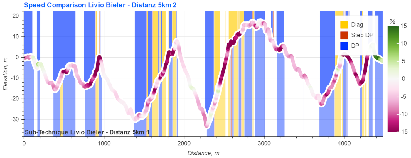
It's a bit a busy graph, but once you get used to it it's very fast to interpret all the data. The colored blocks in the background mark the sub-techniques that have been used. The red-curve has the shape of the elevation profile and the color marks the relative speed difference. The darker red the larger the speed loss was. Green would mean speed gain. Here lap 2 (top sub-technique, slower) is compared against lap 1 (bottom sub-technique, slower).
This speed comparison confirms that the greatest differences, up to 15% or even more, happened mostly in the uphill parts. Almost the same sub-techniques were used for both laps. One could conclude that therefore the performance "loss" for lap 2 was not due to the weather but that probably Livio pushed a bit too hard on the first lap and was unable to keep up the same pace.
Share the race reports
All the data presented above can be downloaded as a single HTML file and shared with the other coaches. The figures are interactive. This race report was already used to analyze races with 20 tracked athletes!
Contact us if you would like a copy of the race report from the 15 km race.