Alpine Skiing Performance Analysis
Introducing red and blue turns
How does it work
- Switch the sensor on
- Wear it during practice or competition
- Our smart algorithms automatically detect, filter, and analyse all movement periods of interest
- Improve the performance based on the (live) feedback
During practice and/or competitions the athlete wears our sensor on his upper back. We provide a specially designed shirt to hold the sensor in place. For highest accuracy and real-time feedback we recommend using our flagship Naos sensor.
With the Naos sensor, data can be instantly streamed to our analysis server and you can access the sport-specific performance data via your smartphone, tablet or computer. With the legacy Admos sensor all data is stored on the sensor itself and you have to download the data via USB after completing a training session or competition.
Our analysis server automatically scans the data for the segments of interest and proposes them for in-depth analysis. With this smart segmentation, the exact start and an approximate finish of each run is automatically detected. No need for a painful browsing through hours of data and manual selection of the start and finish of a segment.
For each segment selected for the in-depth performance analysis our advanced fusion algorithms take all raw sensor data and computes the center of mass kinematics (3D position, 3D speed, 3D accelerations, angles of the upper body in space, and 3D rotation speeds) 200 times per second. The sport specific performance feedback is then distilled from these 3000 data points and visualized such that our users can obtain instant, easy-to-understand, and actionable performance insights.
Performance Analysis Options
- Automatic video synchronisation
- Interactive videos
- Ski line comparisons on videos
- Turn detection
- Split times and section analysis
- Speed and energy curves
Local Video Overlays
In case you have limited internet connection, our local app allows making overlays without uploading any video to the cloud. Only the data needs to be there. Of course with automatic recognition which athlete is in which video. Simply select all the videos you want to synchronize, go have a coffee and when you're back all the videos are synchronized.
In the case you train with the GPS-based timing system of microgate, then you can even get all timing information. An example result is shown below.
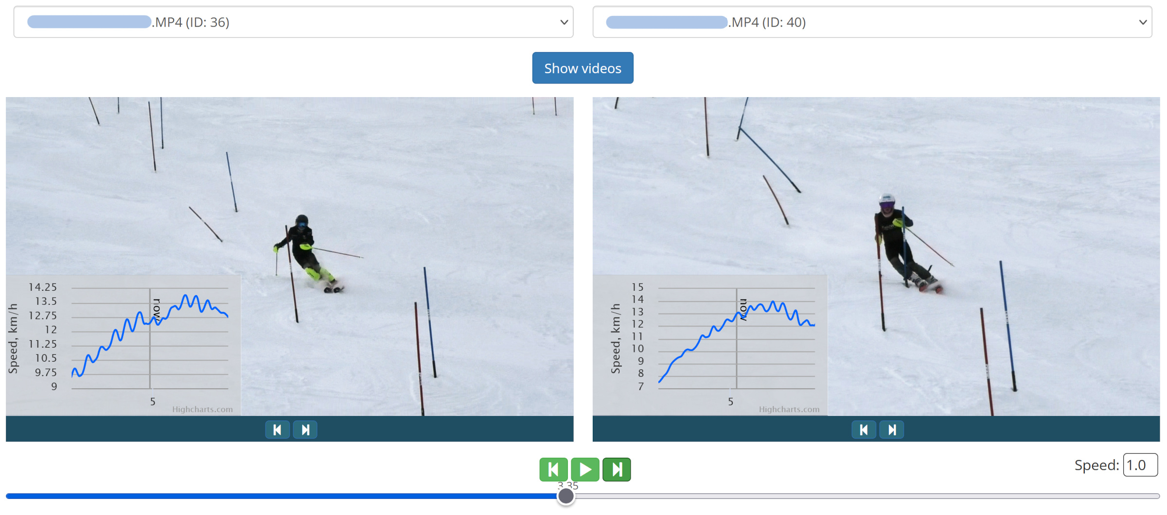
Interactive Videos
All the videos are automatically synchronized with the data in seconds!
Interactively analyze your videos with the connected speed loss plot. Rapidly identify key moments of speed gain and loss and visualize the underlying movement. Athletes love how they can easily understand how their movement affects their skiing speed. The best tool to improve skiing technique and become the next champion.
Side-by-Side Video Player
Compare two videos side by side. With synchronous playback, aligned with the skier's position. Each video can be realigned individually, if necessary.
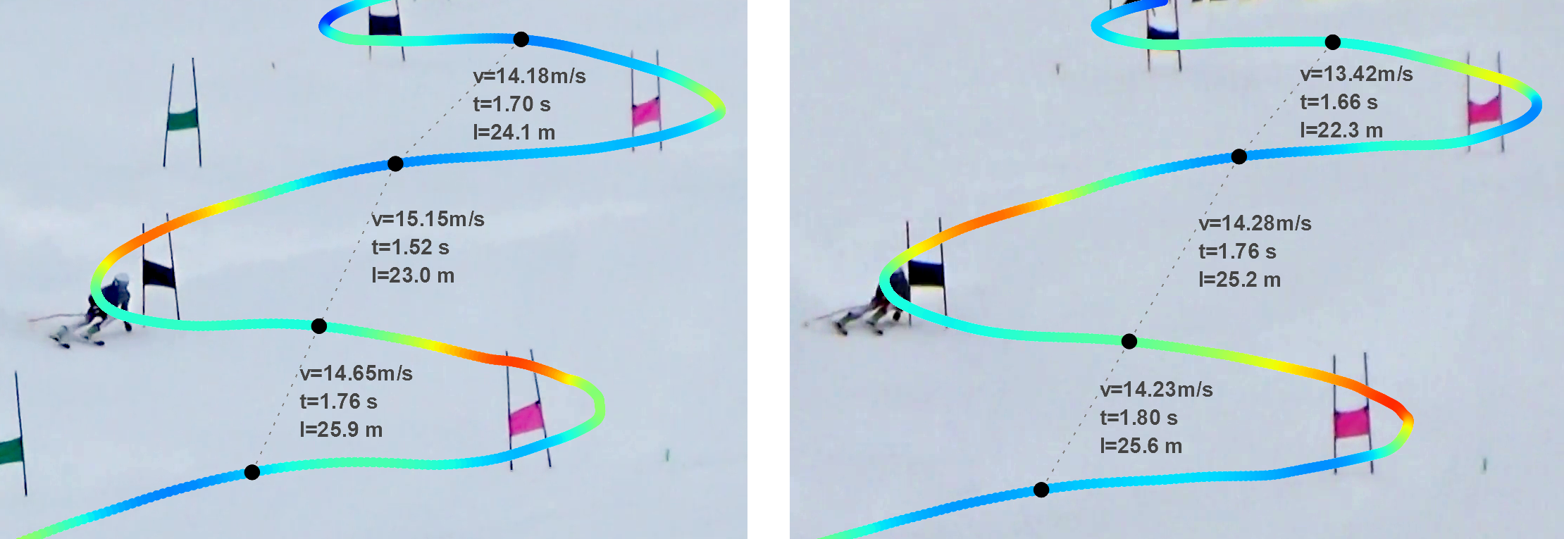
Ski Line Analyses
It only takes a few seconds and you have a detailed ski line trajectory for line comparisons between athletes. Be the first to know which ski line is when the fastest and win the next race. It works with any handheld video camera and works with zoom and pan.
Section Analysis
Set split times and obtain section statistics for each split time, such as entry and exit speeds or the total distance skied. This allows you to identify the best strategy and trade-off between a direct line and keeping speed as high as possible.
All the split times are computed based on the skier's trajectory. Which is obtained by fusing the GNSS (satellite) position information with the data from the inertial sensor. Even with this fusion we are restricted to a position accuracy of about 2m (unless we do the video fusion), depending on the satellite constellation and weather conditions on the day of the measurements. Our sensors and algorithms can estimate this expected position accuracy. Our web application then provides the expected time accuracy. In the figure below, this is 0.04 seconds. This means, that if you see a time difference of 0.04 seconds, it could be anything between 0.0 or 0.08 seconds, but statistically speaking the 0.04 second time difference was the most likely.
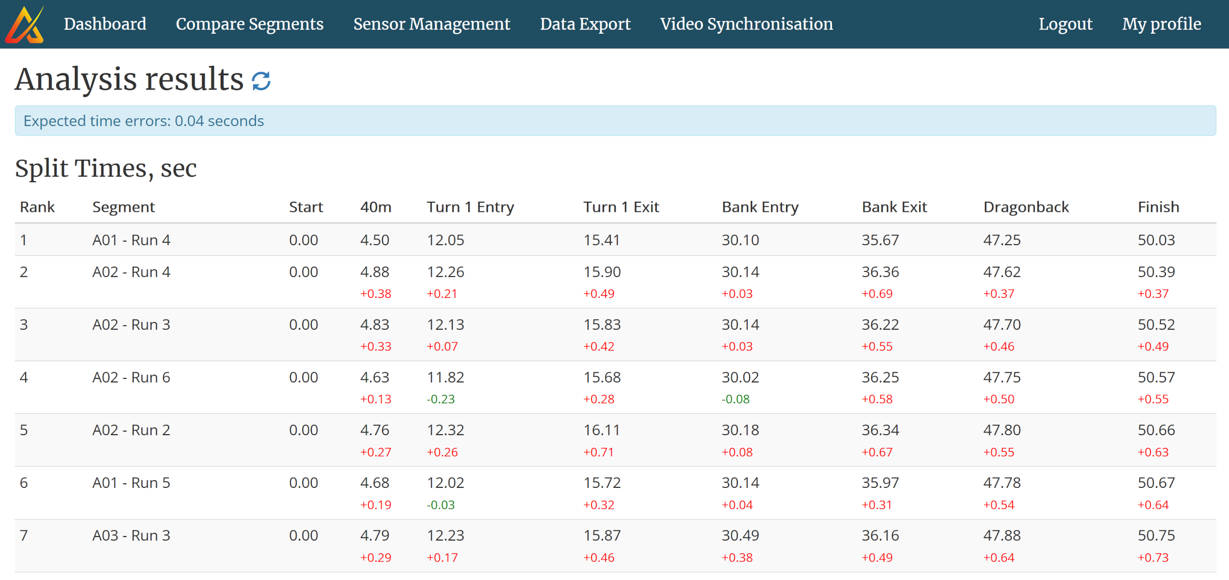
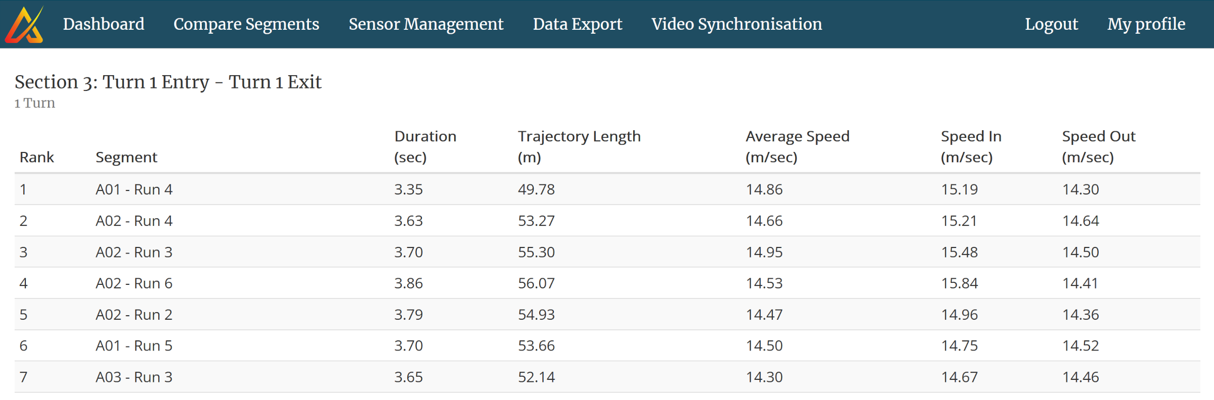
The section analysis allows a strategic analysis of the skiing. What line choice is the fastest and why? In the example below the fastest time (rank 1) had by far the shortest skiing trajectory length, 49.8m compared to over 52m for all other segments. But neither average speeds nor the entry and exit speeds were the highest. This leads to the conclusion, that for this particular section, it is important to minimize skiing length, even if speeds may be a bit lower. Of course, the next section also needs to be analyzed to see whether the lower exit speed did not penalize the athlete later.
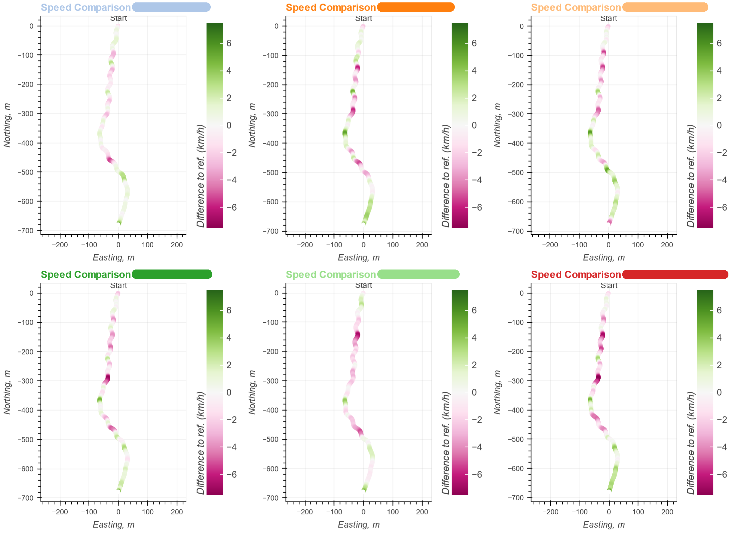
Speed Comparison
Our race analysis allows comparing the speed of all runs against any run of your choice. For the speed disciplines, this helps you to identify the key segments of speed loss or gain. You will also be able to see that the overall fastest run was not the fastest everywhere.
For the technical disciplines you will be able to see speed differences within a turn. With this you can immediately identify technical weaknesses of a given athlete. For example, one athlete might always lose speed at the beginning of right turns.
Areas with lower speed are marked in purple and areas with faster speed are marked in green. In the figure below, one can see that the selected reference was not the fastest everywhere. Especially for the very last part, all other runs were faster. Whereas in the first half, the athlete seemed very good at the right turns with almost no difference in the left turns.
Convinced? You want to understand performance and improve your training as well?