Track and Field Performance Analysis
Accurately track the athlete's movement during all his trainings
How does it work
- Switch the sensor on
- Wear it during practice or competition
- Our smart algorithms automatically detect, filter, and analyse all movement periods of interest
- Improve the performance based on the (live) feedback
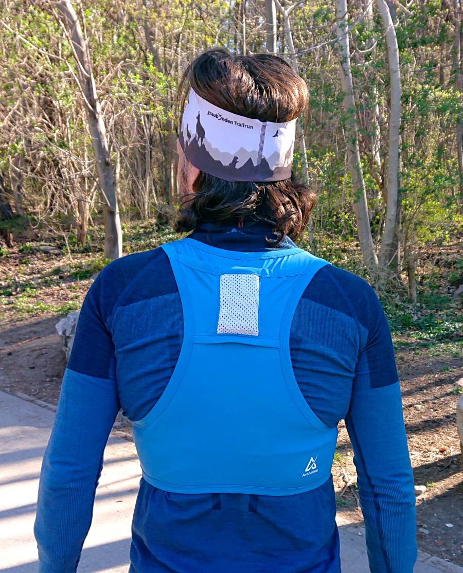
During practice and/or competitions the athlete wears our sensor on his upper back. We provide a specially designed shirt to hold the sensor in place. For highest accuracy and real-time feedback we recommend using our flagship Naos sensor.
With the Naos sensor, data can be instantly streamed to our analysis server and you can access the sport-specific performance data via your smartphone, tablet or computer. With the legacy Admos sensor all data is stored on the sensor itself and you have to download the data via USB after completing a training session or competition.
Our analysis server automatically scans the data for the segments of interest and proposes them for in-depth analysis. With this smart segmentation, each sprint or jump is automatically detected. No need for a painful browsing through hours of data and manual selection of the start and finish of a segment.
For each segment selected for the in-depth performance analysis our advanced fusion algorithms take all raw sensor data and computes the center of mass kinematics (3D position, 3D speed, 3D accelerations, angles of the upper body in space, and 3D rotation speeds) 200 times per second. The sport specific performance feedback is then distilled from these 3000 data points and visualized such that our users can obtain instant, easy-to-understand, and actionable performance insights.
Performance Analysis Options
- Automatic speed overlay on videos
- 10m splits
- Step length, duration, speed
- Instantaneous speed and acceleration
- Speed changes within a step
- Vertical oscillation within a step
- Left - right asymmetries
- Hurdle times
- Contact times
Video Analysis
For easy interpretation of the performance data, for example for technique training, our video synchronization unit allows to automatically synchronize videos with the data. Instantly see how a running technique, and slight changes like a different step length or cadence, affect running speed. Finally, the truly objective video feedback is here.
Play the video in full speed, slow motion or go forwards and backwards frame-by-frame. Use our multi video player for simultaneous playback of two videos.
10 m Splits
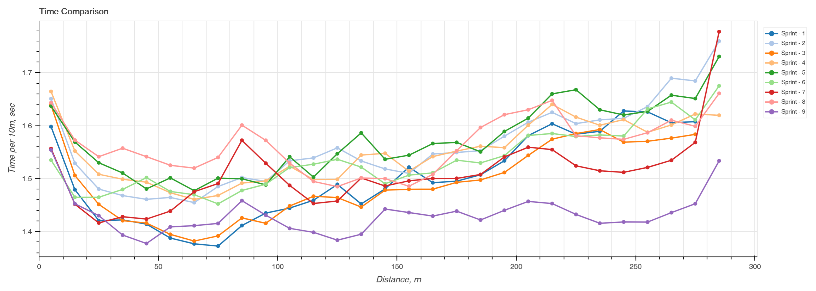
For sprints and mid-distance running 10 m splits are automatically calculated and shown in a figure like the one above, taken from a 3x3 300 m interval training. Each color represents a different sprint. In once glance you can see how the performance is decreasing or increasing along each sprint and the differences between each sprint. Interesting to note here is that the last sprint, the 9th was by far the fastest and that the athlete was able to maintain the speed during the entire distance.
Step parameters
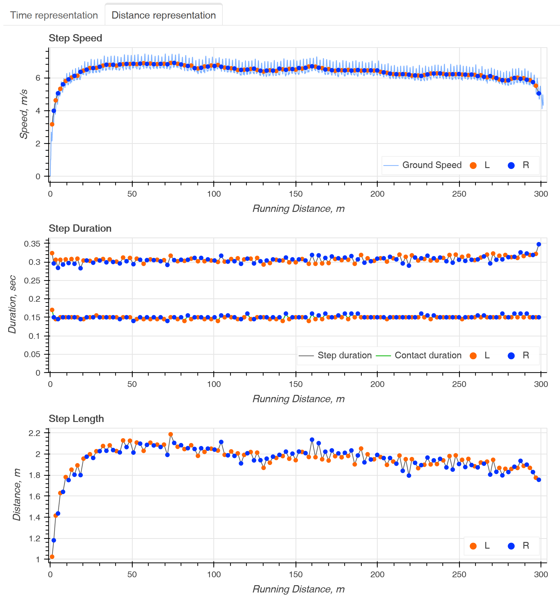
Using motion constraints and the center of mass vertical acceleration, our system detects each foot strike. Combining that data with the center of mass kinematics obtained from our specialized fusion algorithm the system can then compute cycle duration, cycle speed, and cycle distance. Cycles parameters can be plotted against the running time or against covered distance.
In the figure above each dot marks the position of initial contact. Orange for the right foot, blue for the left foot. For the step speed, the dots mark the average speed and the thin blue line in the background the instantaneous centre of mass speed. For the step duration, the higher line shows the step duration and the lower line the approximate contact time.
In the case of hurdles, these step parameters how also how much time the athlete spends going over a hurdle whether she/he is able to maintain a constant speed, step length and cadence before each hurdle. For an in-depth analysis, read our blog entry about hurdles performance analysis.
Instantaneous Speed Comparison
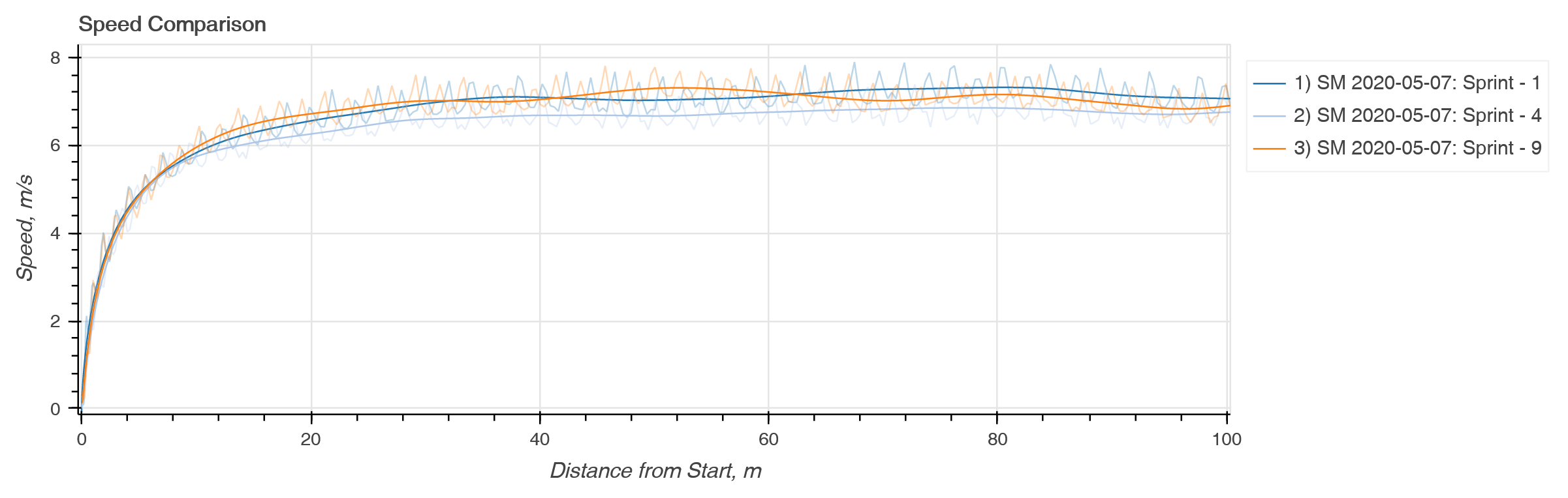
Select any sprints and compare the instantaneous speeds. Instantly see what start "strategy" leads to the highest acceleration and allows and athlete to reach top speed the fastest: is it better to train for a longer step distance, a higher cadence, different trunk inclination? How is a training progress over several weeks, months or even seasons?
Speed and vertical oscillation within a step
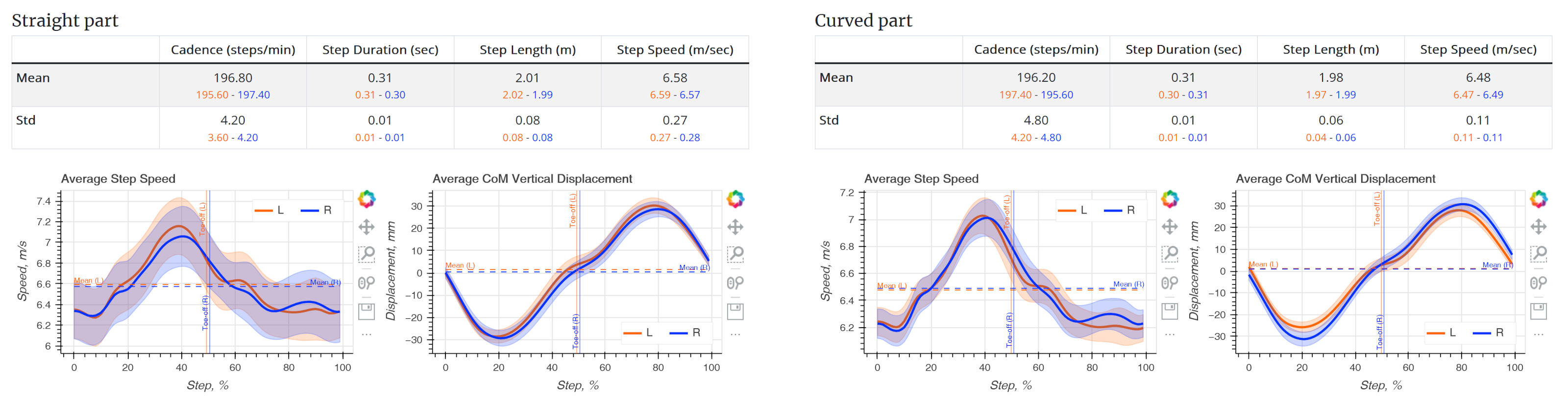
Each step is automatically detected and assigned to the left or right side. The curves are time-normalized to 100% step duration and speed and vertical displacement are averaged for the automatically detected maintenance phase. Each step starts with the initial foot contact. The thick line is the average of all left or right steps and the shaded area the standard deviation
In an ideal world, the instantaneous speed is always increasing during the ground contact phase (approximately the first half of a step). A speed loss indicates an inefficient running technique, involving breaking forces that slow the athlete down.
For the straight part of the maintenance phase, both the speed and vertical oscillation averages should roughly overlay. A difference may be indicative of a force imbalance or injury. But since we are the first to offer the possibility to measure these quantities during every-day training sessions there is no data yet to show what's the limit between a healthy, natural asymmetry and an asymmetry indicating an injury.
In our opinion, the graphs above show an efficient and very healthy pattern. The difference in vertical oscillation for the curved part is natural, as the athlete is leaning inwards and has an inclined body.
Convinced? You want to understand performance and improve your training as well?