Cross-Country Tracking
Remote tracking - how does it work?
We were measuring the performance of two athletes during the FIS race in Beitostølen on Nov 20-22, 2020. However, due to the Covid-19 restrictions no staff from Archinisis was allowed on site. Nevertheless, we were able to get performance data for each race. How did we do that?
Preparation and instruction
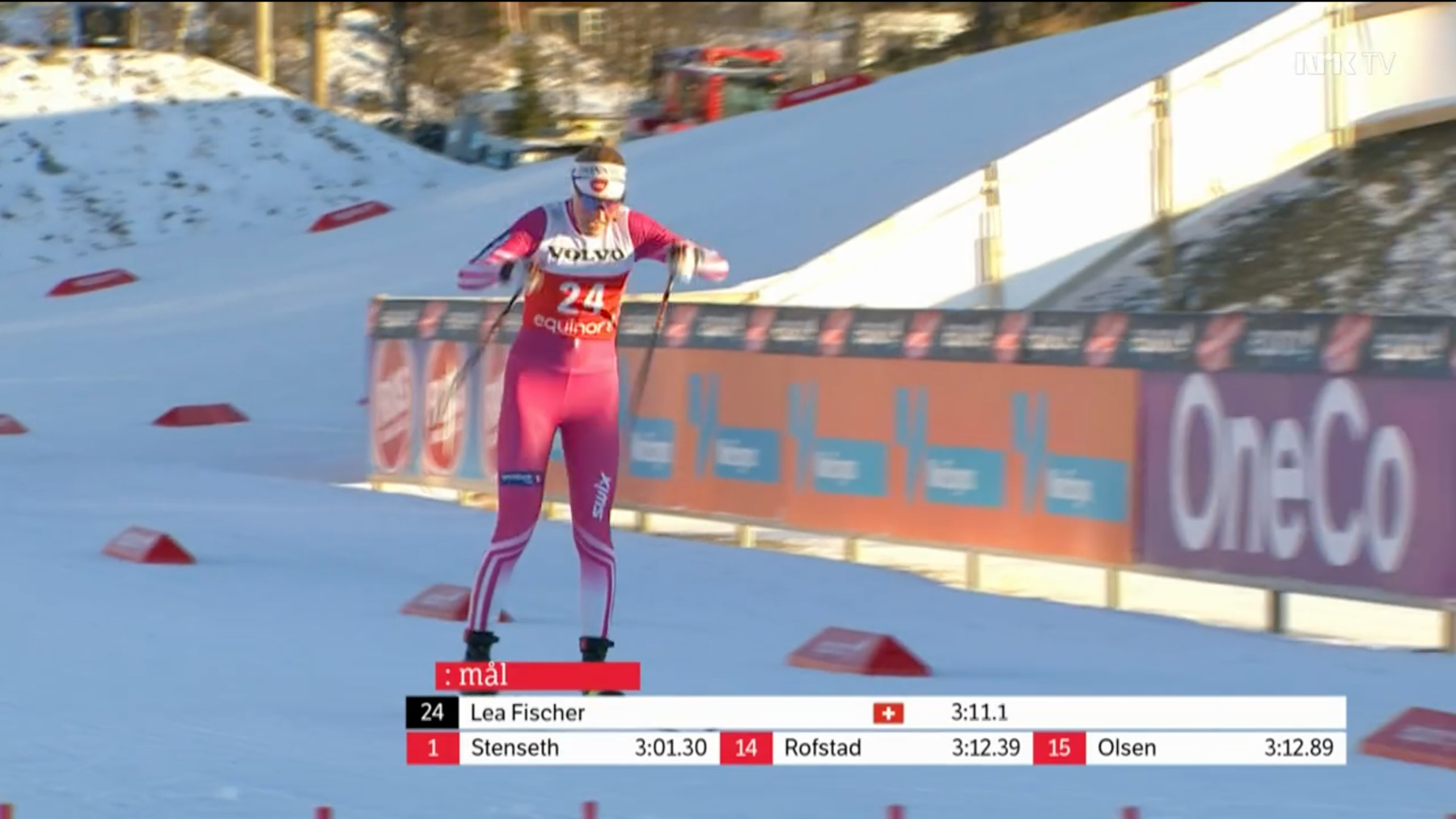
Very simple: a few days before the race weekend Janis, our collaborator in Norway, gave to Lea Fischer (one of the two athletes we monitored) one sensor along with the instructions on how to use it and download its data after each race. That's it, nothing more. Very simple and straight forward.
Race day measurements and analyses
For each race, 5 steps were required to get the performance data:
- 20 minutes before the race Lea switched the sensor on and put it into a pocket in her shirt.
- The sensor automatically recorded all motion data during the entire race.
- After the race Lea switched the sensor off.
- Once she was back at the hotel, she downloaded the data to her laptop and sent it to Benedikt and Janis.
- Benedikt and Janis, sitting in Fribourg and Trondheim, uploaded the data on the webapp. After about 30 seconds the data was automatically processed and available for the race performance analysis.
What performance data did we get?
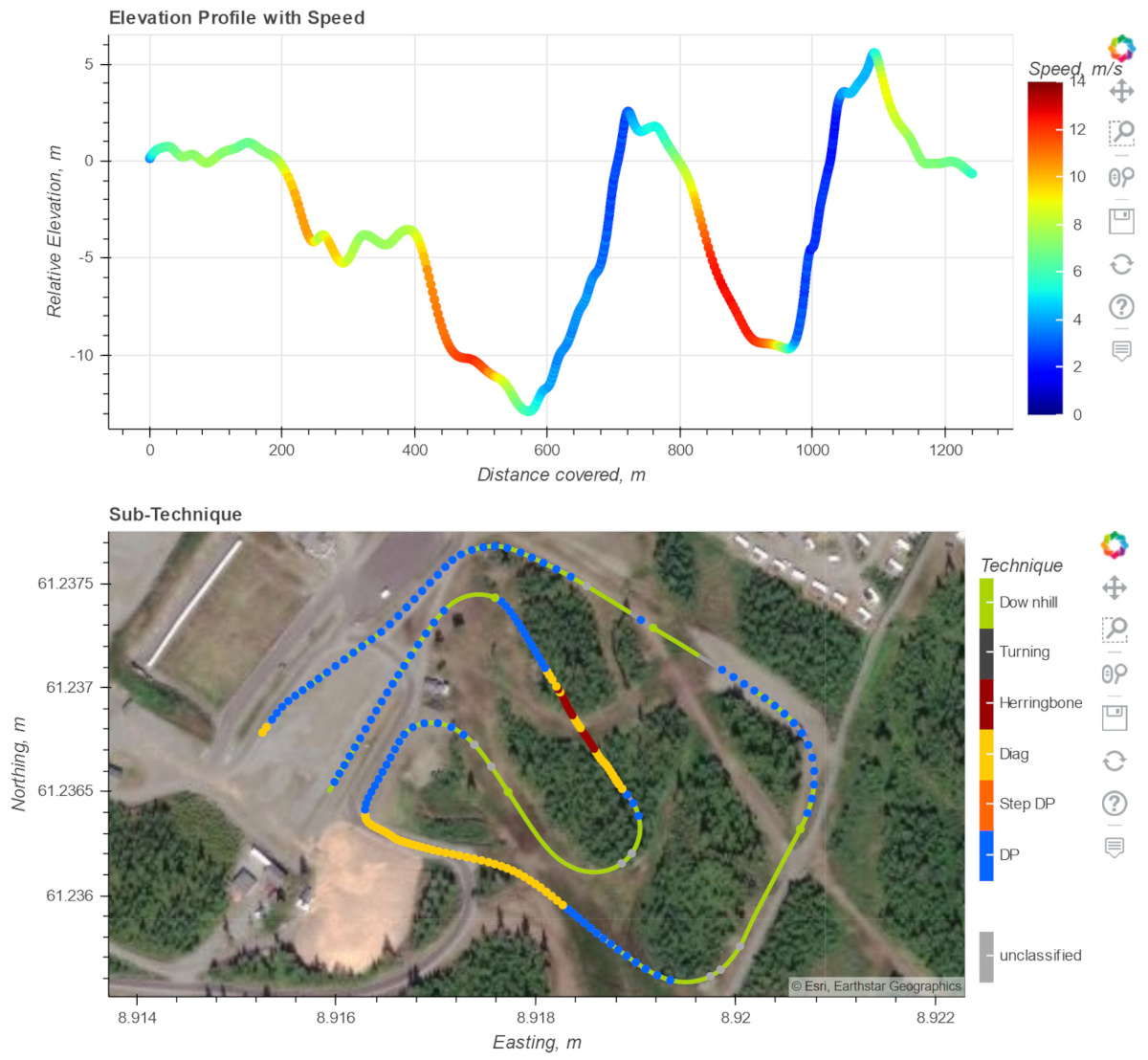
Speed and sub-technique
First, we got the altitude profile with color-coded speed. This provides a quick overview of what the athlete did and where she was how fast. Second, on a map we could see the race track with colored dots that indicate the start of each skiing cycle and the sub-technique that was used. Remember that everything was computed completely automatic and within 30 seconds only! We can analyze classical and skating skiing.
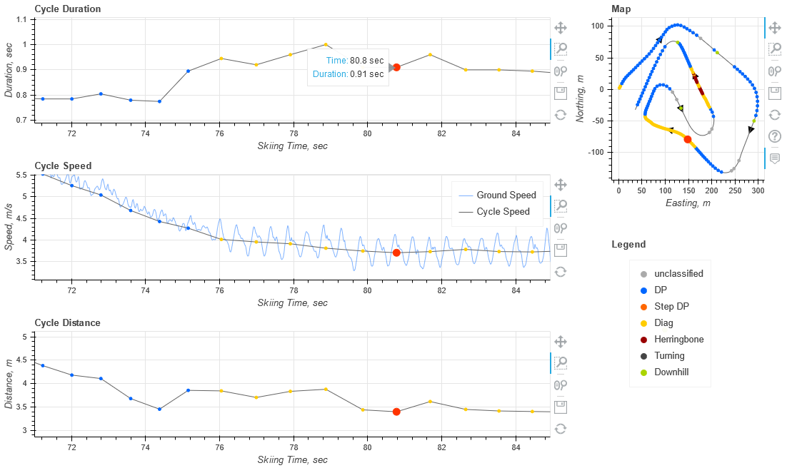
Cycle parameters
If we want to exactly understand what happened, we can use the cycle parameter plots. For each cycle these plots show their duration (i.e. the inverse of the cadence), instantaneous and average speed, and distance. The three plots are connected and the little map on the right side helps to navigate the data.
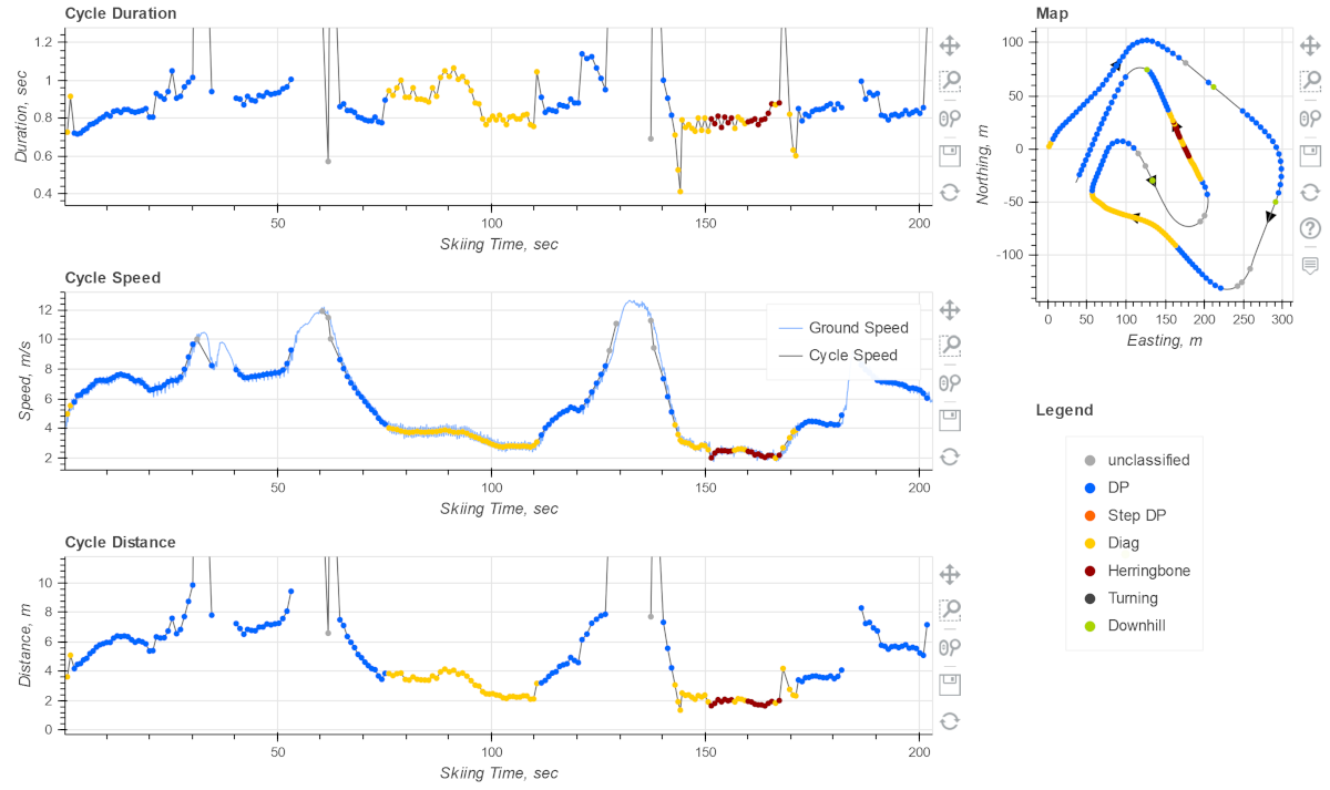
With these plots we can see whether the relationship between cycle length, duration and speed was optimal and if the athlete was able to keep the pace throughout a race.
There is one further level of detail: if we zoom enough we will see the instantaneous center of mass speed, measured 200 times per second. This curve exactly shows the speed gain from pole and leg pushing and the speed loss from the gliding. Our pro users use the shape of the speed curve to verify whether the technique was well mastered by the athlete.